홈  /  작업  /  PurGloss

Case study · Beauty · Client confidential

PurGloss

Barrier-first skincare  ·  purgloss.com · Launching soon  ·  Pre-launch

가격으로 경쟁하던 카탈로그를, 제품 배합은 그대로 둔 채 근거로 경쟁하는 브랜드로 재구축했습니다.

Start a brand like this → 우리 팀과 협업하세요
PurGloss

The transformation

Before

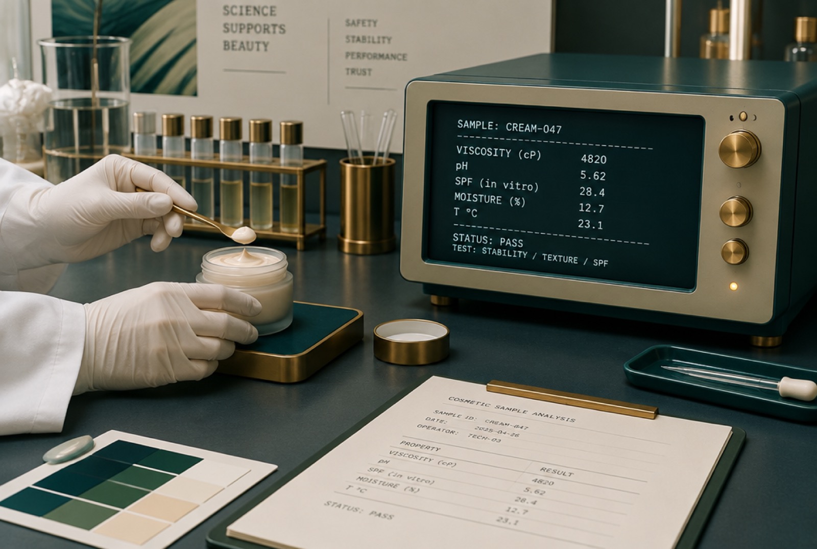
A competent cosmetics range with real formulations, sitting in a category where the only visible difference is the number on the shelf edge. Competing there means discounting, and discounting is a race with one ending.

After

A brand built on a single argument: skin strong enough to stop needing rescue is a better thing to sell than the rescue. It promises the outcome and sells the mechanism.

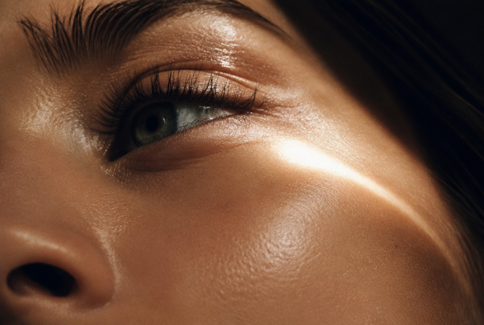
The pivot was to stop selling the products and start selling a position. The name carries the thesis: gloss is not applied to a surface, it is what a healthy surface does with light.

None of this required a new formula. The chemistry, the manufacturer and the stability data all stayed exactly where they were. The entire distance between the old price and the new one is brand equity, and that distance is the deliverable.
Brand identity

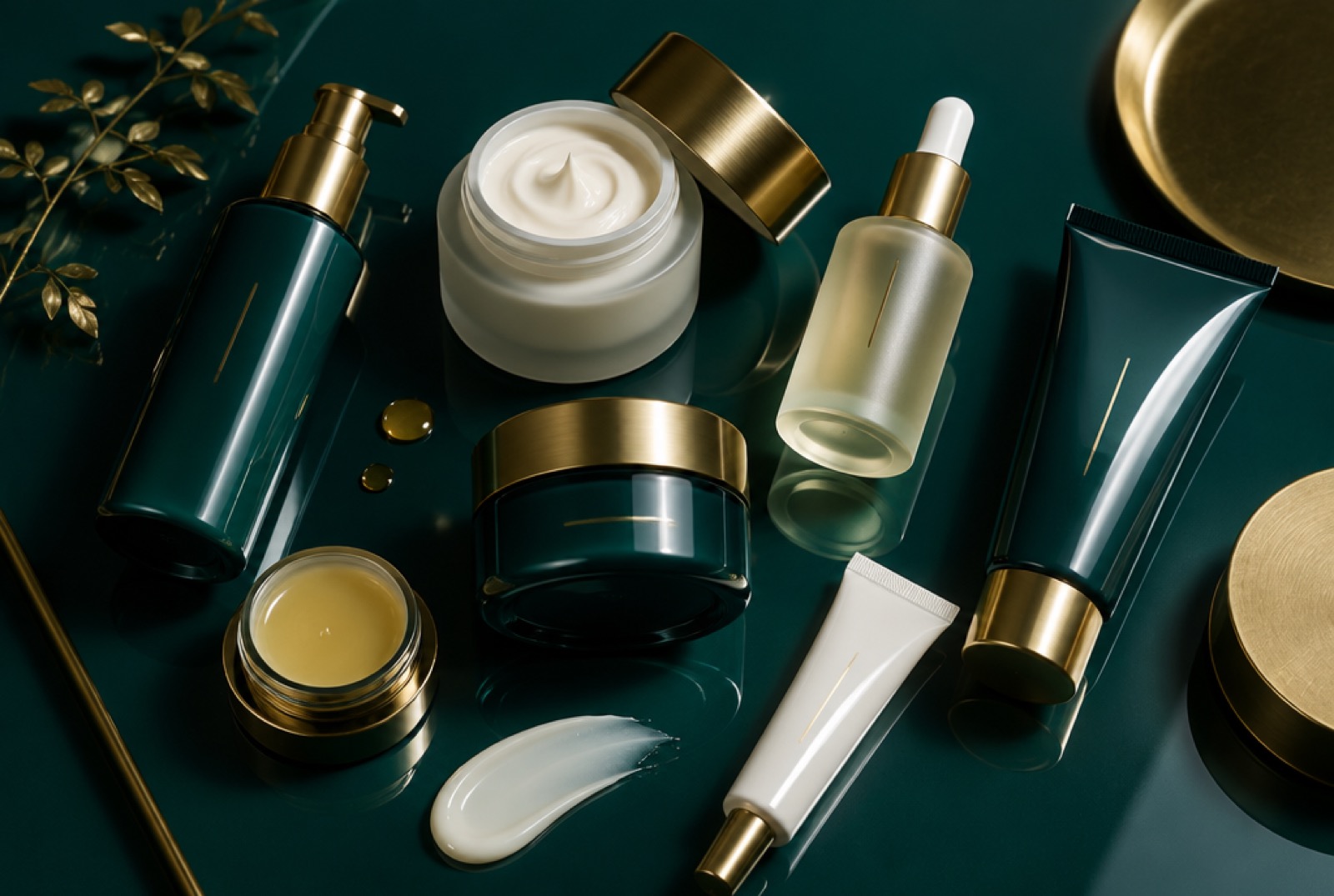
The colour and type system behind the work. Each brand keeps its own palette.

Petrol#10343BDominant ground
Bone#ECE7DAPrimary type
Specular#AFE4DFGloss signal, accent only
Brass#B08D57Foil stamp, never a fill
Petrol, not clinical white: distinct in a feed of white
The brand is named for the optical event
Measure it, then publish the measurement

The method: a formula-preserving rebrand

The transferable part. It applies to any manufacturer sitting on a catalogue that sells for less than it should.

01Audit by function, not by name

Strip every product back to what it physically does. Names hide the real line architecture underneath.

02One naming convention

A single convention applied without exception, so a catalogue reads as a line, not a collection.

03Clear every name before artwork

Trademark, domain, handles. A hard gate, not a parallel task.

04Rebuild against the existing dieline

Same pack, same tooling. Only the printed surface changes, which removes the largest cost.

05Carry compliance across intact

The declaration follows the formula, not the name, so the safety substantiation does not restart.

06Reprice against the new position

The formula is identical, so the whole gap from old price to new is measurable brand equity.

What we delivered

PurGloss has not launched. The product line, names, pricing and full brand book stay confidential until it does. What we show is the method, because the method is the part that transfers.

01
Positioning & the enemy thesis

A specific, checkable opponent customers can agree with.

02
Naming & line convention

A convention that survives the thirtieth product as well as the first.

03
Identity & packaging

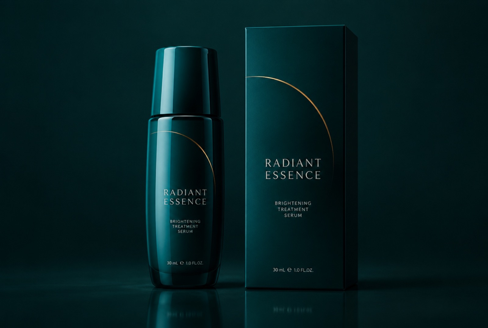
Petrol ground, bone type, a single brass arc, built against existing tooling.

04
Proof & traceability

Published instrumental testing and a batch code on every pack.

05
Copy & claims framework

Every line written to survive a regulator, a chemist and a sceptic.

06
First test film

A real film produced early and cheap, to test the idea before the budget.

More of our work

실제 브랜드를, 처음부터 끝까지 구축했습니다.

식음료 · 출시 완료

Santuk

길가에서 팔던 꿀단지에서, 모든 라벨에 배치 단위 증명을 담은 캄보디아 최초의 테루아 꿀 브랜드로.

사례 보기 →
식음료 · 개발 중

Elephant Cashews

단순한 스낵 회사가 아닙니다. 더 많은 가치를 국내에 남기기 위해 세운, 캄보디아의 대표 프리미엄 식품 브랜드.

사례 보기 →
Food & beverage · Concept

캄포트 후추

샴페인, 다르질링과 어깨를 나란히 하는 지리적 표시(GI) 후추, 그리고 그에 걸맞은 포지셔닝. 클라이언트명은 비공개.

사례 보기 →
Beauty · Delivered

브랜드 권위 진단

실제 유통망을 갖춘 강력한 제품이 정작 권위를 키우지 못했습니다. 우리의 진단 결과 신뢰 레이어가 전혀 없었고, 밈 중심의 소셜 보이스가 오히려 해를 끼치고 있었습니다.

사례 보기 →
커머셜 · 완료

Ever Fresh

독립 제작 예산으로 대형 프로덕션처럼 보이게 만든 슈퍼히어로 '그리스 몽키' 광고.

사례 보기 →

아이디어를 영향력으로

이런 브랜드를 의뢰하세요

One product, one position, one system of proof. Yours could be next. Invitation-only during launch.